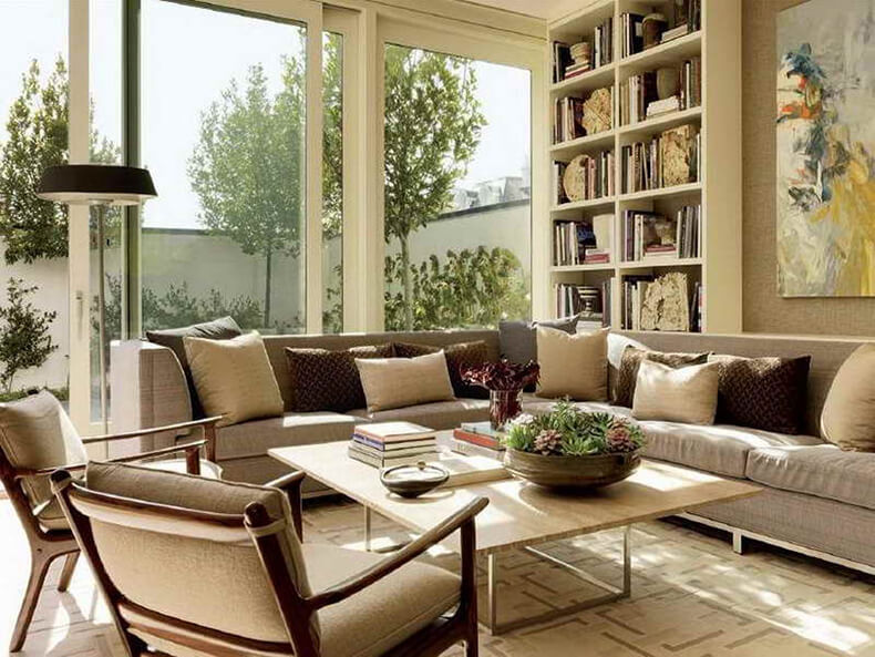
First, let's take a look at what monochrome is, and what is it, monochrome interior? Mono means one, that is, one color predominates in the interior. And it doesn't matter which one - it doesn't have to be black or white, a monochrome interior can be made on the basis of any color.
Each person has their own favorite colors, there may be several of them. Monochrome does not mean using only one particular color, no, monochrome means the use of the entire gamut (many) shades of this color, plus additional colors. Thus, the design is quite interesting: one room can be made in brown tones, another in purple, a third in blue, a fourth in green, etc.

Such an interior is not boring and is not "eaten away", it is well suited for those who love a calm atmosphere in a house or apartment and choose a range that is comfortable for themselves. And if you use the experience of distinguished designers, apply modern materials and adhere to the developed rules for a monochrome interior, then it will retain its freshness for a long time and demonstrate the elegance and sophistication of taste.

So, let's see what these rules are?
1. In a monochrome interior, colors are selected in such a way that there is one dominant (main) and several additional colors. As additional colors, white, black, gray, silver and golden colors can be used, as well as various shades of the main color are used (in principle, the entire range can be used). So, despite the word monochrome, you can create a rather cheerful interior, but with some kind of dominant gamut.

But, of course, there is no absolute categorical observance of these rules. If you come across an interesting textile, with the interweaving of the main range, then why not use it (see photo below)?

In the design of a monochrome interior, a certain principle of combining shades is adhered to: elements of large sizes (walls, floors) are painted or made in the lightest colors, and furniture elements - in darker ones, accessories - in the darkest ones. True, it cannot be said that this principle is adhered to in all cases, it happens and vice versa - the walls are dark, and furniture and accessories are light, but in the same range. It is important not to overdo it and find a balance.

2. The second rule says that the same colors should be used in the texture, especially the main color and its shades. That is, for example, a smooth surface painted in one color must be combined with patterns (by color), geometric shapes, various patterns that may be present in the design of wallpaper, decor, textiles, etc.

In a monochrome interior, matte and glossy surfaces are also actively used, they create an unusual effect on the contrast of light absorption and light reflection. Gloss looks beautiful on walls, columns, furniture surfaces. But, here it is important not to overdo it with gloss, you need to harmonize it with matte surfaces so that this chic does not blind your eyes.
And also, along with smooth elements in monochrome design, volumetric elements are often used. This can be decorative overlays made of wood, metal, 3D panels, a wall lined with corrugated stone (granite or cavernous stone), Venetian volumetric plaster, fabric upholstery, etc.

The design of a monochrome interior looks more interesting if it is divided into zones, using shades of the same color scheme, but using contrast. This technique removes the feeling of cluttering the room with furniture, gives dynamism.
3. And, of course, lighting, its correct design and selection - this refers to the third rule. There are many nuances here and from how it is done, you can get a different effect of perception. With the help of lighting, you can hide something, and emphasize something, create a unique illusion - to revive the interior.

You can hang, for example, a traditional chandelier, or you can mount the lamps in a multi-level ceiling and make the lighting so that the light comes from the inside, diffused. In general, you can think of a lot of options for implementation here.
The simplest monochrome interiors are uniformly light, they are created with slight differences in tones in terms of lightness (darkness). They like to do such interiors in offices where clarity, clarity is needed and so that nothing distracts, in rooms with windows facing north, in some darkened rooms, etc.
As you can see, creating a monochrome interior with your own hands using the above rules is not difficult. You just need to first decide on the color scheme, go shopping, pick up materials, accessories from what is available, and start implementing it. I am sure, after reading this article, now you can make the interior in your apartment much more interesting.
Janet is one of the most famous designers in her homeland. Her style is a combination of sophistication, dramatic accents and a mix of patterns. We invite you to look into her house, which the designer has furnished to her liking - in a fashionable now monochrome scale ... The black and white interior is deservedly considered classic, it never goes out of fashion for a long time. And here again, the designers unanimously call him fashion trend of this season .
Janet Rice lives with her husband, son and daughter in her four-room apartment in Dallas, Texas. Almost the entire apartment, except for the bedroom, is made in black and white. The color scheme of the bedroom is gray-blue, it fits perfectly into the overall style of the interior. It is very difficult to attribute the design of an apartment to any one direction, objects of various styles are harmoniously combined here, which together create an eclectic interior in the style of Janet Rice.
Hallway
Having crossed the threshold of the apartment, the first thing that catches your eye is the elegant style of the hallway. They say that the hallway is a kind of visiting card of the owner, and once in this hallway, it becomes clear that the owner has an impeccable sense of taste. The main role here is played by a black and white pattern with light blue splashes on the walls and a round table, which is located exactly in the center, and under it is a fashionable accessory - a cowhide. On the walls on both sides there are images of the hostess's children, more precisely, the profiles of black faces on a white base. Every detail and little thing is designed in the general style and fits perfectly into the design concept.


The corridor
To go further into the rooms, you must overcome a rather narrow corridor. In the previous article "" we recalled the method that the designer used - in order not to hide the space of the corridor walls, the designer chose white, decorating the walls with large family photographs in black carved frames. 
Living room and dining room
The most spacious room in the apartment is the living room, which is visually divided into two parts - into a dining room and a recreation area, they are separated by small side tables with mirrors that stand on either side of the doorway. Two armchairs with soft pink upholstery are an ideal complement to the black and white interior. This subtle shade echoes the stripes of pink on the tartan upholstered armchair. 


The dining area is designed in a rather businesslike and austere style: a wide black dining table, brown velor sofas and leather armchairs look like this part of the living room was created for business negotiations. Adds a formal coffee table and bar cart. The seating area is made in more delicate colors: pink armchairs, walls with a floral pattern, a white sofa, beige curtains and mirrors. A skin on the floor and a fashionable table with fresh flowers add style and grace to the whole room. In this interior, everything is thought out to the smallest detail - even decorative pillows and a silver coffee table complement each other. Separately, you should pay attention to the walls - this is not wallpaper, as it might seem at first glance, but hand-painted by a designer's girlfriend. 


Bedroom
The design of the bedroom is made in gray-blue tones - such a difference in the color scheme draws special attention to the room. The room breathes with romance, coziness and tranquility. All the details around it contribute to relaxation, and the pastel colors, white bedside tables, light floor lamps and expensive embroidered bedding help to complete the interior of the room.  1
1

 1
1
Kitchen
The kitchen area is relatively small, made in the shape of the letter "T", the main part of which is occupied by the dining table, the working area is a walk-through area, open hinged cabinets with porcelain dishes add elegance to the room. The light color of the kitchen helps to visually enlarge the area of the room, filling it with spaciousness and airiness. 
Janet Rice shares tips on how to apply monochrome black and white colors to the interior of your apartment or house.
1. Choose a leading color in black and white. You can play with contrast and make rooms completely different in atmosphere, using only one technique - choose the main color, and use the other as an accent. For example, in the living room, black is dominant due to the catchy pattern on the wallpaper, and white only sets off the beauty of black patterns. In the dining room, by contrast, white is used as a background color, and black accents in the form of chairs look advantageous against a white background.
2. The third is not superfluous. On the one hand, the black and white color scheme is self-sufficient. But if you decide to apply it to all rooms in the interior of the house, then you simply cannot do without a few other color accents. Use blue (like in the kitchen), pink (like in the living room), yellow, purple shades - they will not diminish the beauty of the monochrome scale, but only emphasize it.
3. Add volume. The interior should never be "flat". Use medallions on the walls, curly frames, framed mirrors - they will add bulge and volume to the room.
4. Full attention to detail. Details play a huge role in creating a holistic image: the base for the table lamp in the living room in the form of a crystal, table lamps in the style of the 60s, delicate ornament on the bed linen, figurines in the form of corals and many other "little things" create an indelible impression of absolute harmony in the room ...
A monochrome interior is a setting in which one color undoubtedly dominates. Most often, restrained shades of brown, gray, blue, as well as white or black act as a color basis for a monochrome interior.
But there are also cases of decorating children's rooms in bright monochrome colors: pink, blue, salad. In the post-Soviet space, rooms decorated in beige and brown tones are a reference example of a monochrome interior. These are the consequences of the so-called "European-quality repairs", massively carried out ten to fifteen years ago.
That is why at first glance it may seem that a monochrome interior is the embodiment of the meager imagination of its creator. But it is not always the case. Indeed, it is in such an environment that the effect of color on the human psyche is fully realized. For example, there is no doubt that it is in the monochrome blue bedroom that sleep will be as calm and deep as possible, and the atmosphere of the monochrome brown living room will be cozy and conducive to productive communication. Often a monochrome interior is chosen by those who are a true fan of a certain color. After all, observing your favorite shade improves mood, increases vitality.
Regardless of the reason that prompted you to give preference to a monochrome interior, you should take care of its competent filling with various details. Otherwise, the room will be perceived as inexpressive and boring. It is not difficult to revive a monochrome interior: it is enough to use the proposed simple, but effective techniques!
- Use shades of the dominant color in the interior, complementary colors
Black, white, gray, silver, golden are the universal colors that can harmoniously complement any monochrome interior. But keep in mind that the complementary color should stand out from the dominant one. For example, diluting dark blue or brown interior colors with black elements is clearly a bad idea.
Another way to revive monochrome is to introduce three or four of its shades into the interior. For example, the colors chocolate brown, ecru, mustard, terracotta will gently complicate the perception of a monochrome brown setting.
- Play with textures
The best option is the presence of both glossy and matte textures in the same room. But don't overuse the abundance of reflective surfaces: glass, mirrors, polished metal or plastic. Otherwise, there is a risk of going beyond good taste.
In almost any monochrome interior, small items with a complex texture will not be superfluous: fur, velvet or imitating burlap, wicker mat. These can be pillows, rugs, floor decor. It is not worth placing them in the amount of several pieces in each corner; two or three items for a small room will be quite enough.
Textured plasters, 3D panels, structural paints will also come to the rescue. In a similar way, you can decorate one wall in a monochrome room and at the same time, if necessary, visually adjust its proportions.
- Adopt architectural techniques
What is the essence of "revitalizing" a monochrome interior using architectural techniques? In the fact that complex forms appear in the room, attracting and holding the attention of the observer. Place a niche with shelves on the wall, zone the room with a partition with holes, install sliding doors - and the monochrome interior will surely become more dynamic.
- Complicate your monochrome interior lighting scheme
The presence of several light sources in a single-color room is a simple but effective idea to "revive" it. Avoid the standard arrangement of just a chandelier in the middle of the ceiling and a table lamp. Try to create your own original scheme, including spot ceiling or floor lamps, LED strips, candles, "floating" ceilings, light panels. Non-standard light sources will not only become semantic accents in the interior, but due to the different intensity of the glow, they will visually divide the monochrome color into several shades.
5."Revive" the interior in the literal sense!
A bit of nature in any interior is a universal solution that allows you to create a comfortable atmosphere. It is recommended to start an aquarium only for people who have a lot of free time to analyze the intricacies of handling fish and algae. A simpler option is to have large flowers in floor pots. From the variety of flora, you can choose some types of unpretentious plants, the care of which is minimal. An interesting option that is not yet very common in residential premises is vertical gardening. As a result of simple manipulations of florists, a live green "carpet" appears on the wall. Vertical gardening is also a great way to improve the indoor climate and enrich the air with oxygen.
Light monochrome shades optically increase the volume of the room, which is why white and beige have become the basis of the color scheme. The layout of the public area - a combined living room-kitchen - made it possible to create a comfortable and well-lit space.
Living room
The recreation area denotes the compositional center of the combined area. From the side of the window, a wide loggia with panoramic glazing is adjacent to it, from the inside there is a dining area, a kitchen and passages to the corridor and bedrooms.
The monochrome interior of the living room is formed by the pure white color of the walls, ceiling, whitewashed wooden floor, upholstery of the sofa group. The volumetric texture of surfaces (moldings on the walls, different levels of the backlit ceiling) enriches the visual range, while remaining within the chosen palette.
The snow-white space is beautifully broken by the dark brown wooden cladding in the TV area and on the loggia, the same dark base of the coffee table. As a transitional color element that softens the contrast, beige shades of carpet and sofa cushions appear in the design of the living room.
Kitchen
The dining group is also decorated in a smart white color and forms a harmonious ensemble with the kitchen front. Contrasting brown details (marble apron and table top, wooden chair legs, facing of the fireplace portal) enhance the freshness and purity of the light background. Gold accents in the form of pendant lights and wall lights emphasize the commonality of the kitchen and living room design.

Hallway and corridor
The entrance lobby is decorated in a one-color version. The white marble floor sets the backdrop for a nice contrast with the dark bench. The mirrored wall expands and brightens the space even more. A white chest of drawers built into a niche with golden handles is logically continued by a mirrored wardrobe in the corridor. In the decoration of the walls, the same technique was used as in the living room: solid white surfaces, so as not to seem monotonous, are transformed by moldings and high baseboards.

Bedroom
The monochrome interior of the bedroom is painted in more muted - beige - shades. The color background is set by the wall behind the bed, the facades of the built-in wardrobe, the floor carpet, slightly lighter bedside tables, and a pendant lamp. A high quilted headboard is one of the 2020 interior trends.
White color plays the role of a balanced addition in the decoration of the room. The wall with the TV panel, highlighted with classic moldings, stylistically connects the design of the bedroom with the decoration of the living room-kitchen.

Children
The room is designed for two girls. The storage systems are designed in the form of a large wardrobe, a chest of drawers and two identical racks with lower drawers. The function of sleeping places is performed by sofas. A desk has been designed for the entire length of the room; this technique will allow organizing an autonomous workplace in front of a large window for each of the girls.
The room is designed in neutral beige tones. White cabinet furniture emphasizes the light design, and toys, textiles, wall graphics can act as bright touches.

The selection of white and beige as the base color makes it possible to create a beautiful, cozy and bright living space with modern finishes. The shades are universal for decorating public areas and bedrooms, forming a holistic image of the project.
Monochrome interior - three rules of implementation
- So that a design created in one color does not seem one-dimensional, you need to turn to the tint palette of the color dominant. Due to the combination of halftones, the desired depth and volume appear, the design becomes more expressive. It is allowed to include a contrasting color for accents.
- Textures will help neutralize the effect of some boring monochrome furnishings. The same color reveals itself in different ways on different surfaces: matte and glossy, leather, fabric, wood, fur. Volumetric areas on a smooth wall look interesting and original - untreated brickwork, embossed decorative plaster, 3D panels.
- Monochrome design always needs competent, good lighting. Dim light will impoverish the composition neatly built of halftones, making it inexpressive. And vice versa: correctly placed sources will emphasize textures, patterns, volumetric details, built-in lighting will transform the ceiling and help visually separate it from walls of the same color.

Light and dark scales
When choosing a uniform color range, it is important to understand which palette is intonationally closer to you. Light pastel shades are considered calm and comfortable for everyday perception. They are great for rooms with insufficient natural light or low ceilings. They create a cozy, welcoming atmosphere. Adding an accent shade will prevent the setting from turning into an amorphous light spot.

Rich colors such as blue, green, burgundy and even black are used to create a dark monochrome color scheme in the interior. You need to really love the dark color so that it doesn't overwhelm you emotionally. The overall impression may seem dramatic, it will be diluted with glamorous metal decor in the form of lamps, mirror frames and accessories in neutral shades (light beige carpets and bedspreads, white photo frames, plain light curtains).

Options for monochrome style in the interior
To use a single-color design in an apartment or house means to surround yourself with beautiful and rich undertones of your favorite color scheme.
- Elegant white
White color helps to expand the boundaries of the room, great for renovating small apartments. It looks laconic and fresh both in classic design and modern. Depending on the tonality of lighting (cold or warm), it becomes more strict or more gentle.

- Noble gray
Monochrome is a versatile alternative to white design when you want to create a light and cozy environment in a subdued way. The palette is well suited for the aesthetics of the Scandinavian style, rich in textures and natural materials. Walls, ceilings, furniture and accessories (pillows, carpets, blankets) are decorated in gray tones. The wide range of shades allows you to find very subtle combinations.

- Calm brown
The brown range is rich in shades - from neutral to very warm. So the decoration of the room will receive both the required volume and expressiveness due to the combination of dark and light surfaces. Adding a bright white color (white skirting boards, cornices, ceilings, door and window frames) will balance the color saturation.

- Red and purple
Color solutions in the red range perfectly combine cold and warm tones: cherry, carmine, wine, pomegranate. With the addition of brown and orange, beautiful complex shades of the base color are obtained, perfect for velvet sofa upholstery, matte walls.

The original design of the apartment in the style of art deco can be done on the basis of purple. A dense, intense tone needs a light decorative environment - silvery cushions, golden fixtures - and ample natural light.

Monochrome interiors are a fascinating and painstaking work with shades of the same color, where it is important to find such combinations and successful accents in order to avoid visual monotony and dullness in the end.
In each apartment and house design project, we embody the most advantageous balance of architectural, planning and color solutions, taking into account the interests and wishes of the customer.
It is quite easy to create a trendy interior in a monochrome color palette. Interiors in one shade are charming as they look very stylish and tasteful. In such rooms, everything is thought out to the smallest detail. You just need to get acquainted with the inspiration from this article and decorate the room correctly.
The main principle of monochrome interior is to choose the right base.
The choice of the main, that is, the base color, will affect not only the appearance of the interior, but also your well-being. Before you do that, it's worth learning more about the effect of color on mood. Not every color will work in a specific room at home. The key to a stylish composition is the correct combination of hues and skillful control of the saturation and tone of a given color. 
For example, red, although it gives the interior a cozy atmosphere, does not fit into the bedroom, because it has a stimulating effect, which makes it difficult to fall asleep, leading to fatigue. It is better to decorate the living room with this color. 
The blue color scheme is perfect for a break room. This cool color helps to calm and relax. Purple works in a similar way. 
In turn, orange and yellow optimize the mood by injecting warmth. Orange also increases appetite, making it a great choice for a kitchen or dining room. 
Delicate whitewashed greens, warm gray - a color palette that contains many subtle suggestions for people who feel good surrounded by neutral hues. 
If you prefer attractive solutions, look for matte plum or vibrant greens. 
Advice! Keep in mind that saturated colors become boring faster than those considered neutral.

Monochrome design of rooms: one color has several shades
Choosing one color doesn't really restrict you from using other shades from your preferred range. You just have to learn how to pick out color options from the base. The varying intensity of the colors is enough to make the interior of the room interesting. In addition, you have various decorative details and subtle accents in other carefully selected shades. 

Advice! Paint the walls with the lightest shade of the base color. For a more intense toning, choose a sofa or curtains. The interior can be brightened with decorative pillows or other accessories in the darkest version of the selected color.

How to break the monotony correctly?
Monochrome in the interior will not be boring if diluted with various materials and textures. It is worth combining matte and glossy surfaces. The same color will look different on a wall, on a leather chair, or on a fluffy rug. Don't forget about the possibilities offered by contrasts. To prevent monotony, designers often incorporate different shapes and textures in styling materials such as metal, glass, or fabrics. In addition, each of the materials works in a completely different way with light, the decorative possibilities of which are practically unlimited. This is a very important element that determines the appearance of the entire interior, not only in the case of monochrome arrangements. 
Monochrome color in the interior: fashionable combinations
Currently, monochrome stylizations are very popular among those that use neutral colors such as white, gray or beige. To avoid boredom and to brighten up the interior a little, they are usually combined with natural and organic materials such as wood, stone and textiles. 
Graphite and white
The combination of white and black has an interesting visualization. If you like this composition, but want to dilute it a little, use intermediate colors from the same palette. Shades of graphite and white will create a clean and expressive composition and at the same time give the room a comfortable atmosphere. Complete the arrangement with accessories in bold colors to create a pleasing and elegant contrast. 
Blue, light blue and gray
Choose blue for an elegant alternative to black. This will add depth to the decor without worrying about all the styling dominating. Blue and white is a classic, proven combination. If you want to use smooth transitions, then replace the white with a light blue or light gray shade. For richer colors, choose navy blue, which is an elegant alternative to black, while adding styling depth without an overwhelming effect. Use wood products with a glossy finish so that they stand out against the dark blue walls. 
Gray and its shades
A dark shade of gray is the choice for those who appreciate the elegance of style, infusing their home with a relaxing atmosphere combined with a lighter tone. The light shade of gray has become extremely popular in recent years as a versatile alternative to cream and white. On the other hand, the dark gray color palette is the perfect solution for those who value simplicity and elegance. This combination is great for the role of a neutral interior. 

Dark and pastel green
Green is generally seen as the epitome of peace, so it works best in places that are supposed to be an oasis of relaxation, such as bedrooms and living rooms. The deep and delicate green color combined with the subtle, pastel shade creates an atmosphere of freshness and is a great solution for all nature lovers. It is also the optimal solution for people who need concentration, so it is worth using it in a student's room or doctor's office. 

Beige and white
Combining warm beige and crisp white is a proven way to achieve elegant style in a modern home. It is also ideal for small rooms. Warm and vibrant colors allow for an optical extension of the room with natural light that makes everyone feel comfortable. To enrich this color combination, complete the styling with accessories in neutral colors with tactile fabrics. 
Monochrome in the interior is a great idea for modern design, where everything is executed consistently and deliberately. Choose the base of your room and complement it with the appropriate range of shades.